Clean lettering comes from three things you control before the pen ever gets hot: a layout you have measured, guidelines you can trust, and a nib that suits the size of your letters. If you want to know how to wood burn letters that look even from the first word to the last, start with a pencil and a ruler, not the burner. The burning itself is the easy part once the planning is done.
This walkthrough covers spacing, tracing, nib choice, the outline then fill method, heat and speed, curves, and how serif and script styles change your approach. If you are brand new to pyrography, our step-by-step guide to your first burn covers setting up the pen and making basic lines, which is everything you need before tackling words.
Plan the layout and spacing first
Most lettering that looks wrong is spaced wrong, not burned wrong. Sort out spacing on paper, where mistakes cost nothing.
Start by measuring the area you have to work with and leaving a margin. On a small sign or ornament, keep at least 1 to 1.5 cm clear around the edges.
Next, find the centre line. Write each line on a strip of paper, fold the strip in half and line the fold up with the centre of your board. That centres text far more reliably than starting at the left and hoping.
Space letters by eye, not by ruler
Equal measured gaps between letters actually look uneven, because round letters like O and C carry less visual weight at their edges than straight letters like H and I. Sign painters space by area: round letters sit a little closer to their neighbours, two straight uprights sit a little further apart. Squint at your draft from arm’s length and nudge any pair that looks adrift.
Leave a word space roughly the width of a lowercase o in the style you are using. Between lines, allow at least half the height of a capital letter so descenders on g, y and p do not crash into the capitals below.
Draw guidelines and trace your lettering
Guidelines are light pencil lines that set the baseline, the cap height and the x-height (the height of lowercase letters without ascenders). Draw them with a hard pencil such as a 2H, pressing gently, so they erase cleanly after burning.
Hand draw the letters between the guidelines, or print text at the exact size you need and transfer it with graphite paper. Our article on transferring a pattern onto wood compares graphite paper, pencil rubbing and heat transfer in detail.
A few habits make tracing more accurate:
- Tape the printout along one edge only, so you can lift it like a page and check your progress without losing alignment.
- Trace with a ballpoint pen or a fine stylus and a ruler for the straight strokes. Freehand tracing wobbles more than you expect.
- Sand the board to 220 or 320 grit before transferring. A smooth surface takes a crisp line and lets the nib glide.
Basswood, birch and maple are the friendliest woods for lettering because their grain is fine and even. Pine and oak have hard and soft growth rings that make lines lumpy. Our guide to the best wood for wood burning explains why grain matters so much for fine work.
The best wood burning tip for writing
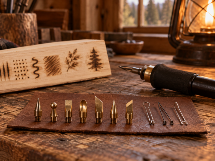
Two nib styles do most lettering work, and the right one depends on letter size and the type of burner you own.
Writing tip or ball tip
A ball tip (sometimes sold as a writing tip, round tip or ball stylus) has a small rounded end. Because it has no edge, it moves in any direction without catching the grain, much like a ballpoint pen. That makes it the most forgiving choice for script and for beginners.
Expect slightly thicker lines with a solid point, so letters under about 1 cm tall can fill in at the counters (the enclosed spaces inside a, e and o).
Fine wire nibs for small or detailed letters
On a wire nib machine, a writer nib (a tight bent loop or a small ball formed on the wire) heats in seconds and cools almost as fast, so you can stop at the end of a stroke without leaving a blob. A fine skew or tight round heel nib works well for crisp straight strokes and serifs. For tiny text on ornaments, a wire nib is the clear winner because the line can be very thin.
If you are still deciding between machine types, our comparison of solid point and wire nib burners covers the trade-offs, and the nib chart in the previous article shows what each shape does.
How to wood burn letters: outline first, then fill
For anything thicker than a single pen line, the most reliable method is to burn the outline of each letter first and fill the inside second. The outline gives you a hard boundary, and filling inside a boundary is far easier than trying to make one thick stroke with a perfect edge.
- Set the heat a little lower than you think, then test on scrap of the same wood.
- Burn all the straight outline strokes first, using a ruler or straight edge as a guide if you like.
- Burn the curved outline strokes next, turning the board rather than your wrist.
- Go back over the outline once more at the same heat to bring it to an even darkness.
- Fill the inside with small tight circles or short strokes that follow the direction of the letter, working up to the outline but not over it.
- Erase the guidelines once everything has cooled, using a soft white eraser.
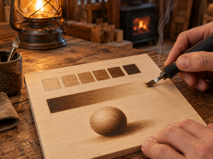
Building darkness in two or three passes looks much smoother than one slow, very hot pass. A single heavy pass scorches a halo and leaves a bumpy edge. Layering is also the core idea behind good tone work, which our next article on wood burning shading techniques takes much further.
Consistent heat and speed
Line darkness is a balance between temperature and how long the nib stays in one spot. Move fast and the line is light. Slow down and it gets darker and wider. Pause, and you get a dot.
On a dial with settings from 1 to 10, most lettering on basswood sits around 4 to 6 for a ball tip on a solid point pen, and somewhat lower on a wire nib machine because the wire runs hotter at the same number. Treat those numbers as a starting point and trust your scrap test.
Habits that keep lines even
- Put the nib down while already moving, and lift it while still moving. Landing and stopping dead create dark dots at the ends of strokes.
- Use light pressure. Let the heat do the work. Pressing harder digs a groove and makes the line wander as the nib follows the grain.
- Clean the nib often. Carbon build-up acts as insulation, so a dirty tip burns lighter and drags. A quick wipe on a brass brush or a fine abrasive pad keeps it consistent.
- After you raise or lower the heat, wait 30 to 60 seconds before burning again on a solid point pen. They take time to settle.
- Rest your hand on a sheet of paper so you do not smudge the graphite.
One more trick: burn all the letters to a medium tone first, then do a second pass on the whole word. Finishing each letter before moving on lets tone drift across the word.
Burning smooth curves
Curves are where wobbly lettering gives itself away. The fix is mostly about body mechanics. Your hand draws its smoothest arcs when it pivots from the wrist or elbow in a natural direction, usually pulling the stroke toward you. So instead of contorting your hand around the inside of an S, rotate the board so that every curve becomes a comfortable pull.
Break long curves into shorter sections. On a capital O, for example, burn the left side in one pull, turn the board, then burn the right side to meet it. Overlap the joins slightly at a slightly faster speed so the overlap does not show as a dark spot.
Tight curves tempt you to slow down, which darkens the line. Drop the heat a notch for sections full of tight loops.
Wood burning lettering tips for serif and script styles
Block and sans serif letters
Simple block capitals are the easiest place to start. They are mostly straight strokes, and small errors are easy to hide by widening a stroke slightly.
Serif letters
Serifs are the small feet and flicks at the ends of strokes. Burn the main strokes first, then add serifs as separate short marks with a fine edge, such as a skew or the edge of a small shader held on its side. Keep serifs the same length across the word by marking their tips lightly in pencil before you burn.
Many serif styles also have thick and thin strokes. Outline both sides of the thick strokes and fill them, and burn the thin strokes as single lines.
Script and cursive
Script looks flowing, so people expect to burn it in one continuous movement. In practice, it burns better in short strokes that join. Pick natural break points at the bottom of each letter’s curve, lift, turn the board if needed, and restart with a moving touchdown. A ball tip is the best wood burning tip for writing script because it does not care which way you move.
For modern brush script with thick downstrokes and thin upstrokes, burn the whole word as a thin monoline first. Then go back and thicken only the downstrokes, outlining and filling them.
Christmas signs, ornaments and other lettering projects
Lettering is at its most popular in the run-up to Christmas, when burned names on wood slice ornaments, family name signs and personalised gift tags become the projects everyone wants to make. They are also good practice.
Wood slice ornaments are usually birch or basswood rounds around 6 to 10 cm across. A single name in script fits nicely across the middle, with a small sprig of holly or a star burned below. For family name signs, choose a plank of basswood or poplar, plan the layout with the centre line method above, and keep the main name in bold block or serif letters with a smaller script line underneath.
Avoid plywood for signs. The glue layers give off harmful fumes when burned and the face veneer burns unevenly. Whatever you burn, work with good ventilation and a fan or fume extractor pulling the smoke away from your face.
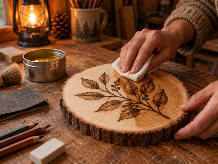
If you want ready-made designs to practise borders, holly sprigs and decorative flourishes around your lettering, the free printable patterns on our wood burning patterns blog are good material to trace and burn. When the burning is done, a light coat of finish protects ornaments from handling, and our guide on how to seal wood burning covers which finishes keep the lettering crisp.
Frequently asked questions
What is the best wood burning tip for writing?
A ball tip, also called a writing tip, is the easiest for most lettering because it moves in any direction without catching the grain. On a wire nib burner, a fine writer nib gives thinner lines for small text. Skew nibs help with crisp serifs and straight edges.
How do I burn letters into wood without them looking shaky?
Keep the heat moderate, use light pressure and move at a steady speed. Turn the board so every curve is a comfortable pull toward you, and break long curves into short joined strokes. Building darkness in two passes also hides small wobbles.
Why do I get dark dots at the start and end of my letters?
The nib is resting still for a moment as it touches down or lifts off. Start moving before the nib meets the wood and keep moving as you lift it away.
Can I use a stencil for wood burning lettering?
Yes. Print or draw your text at full size and transfer it with graphite paper, or trace inside a plastic letter stencil with a hard pencil. Do not burn directly against a plastic stencil, as the heat will melt it and the fumes are unpleasant.
Continue the Learn Pyrography series
This is part 8 of 13. Previous: Wood Burning Tips Explained: What Each Nib Does and When to Use It. Next: Wood Burning Shading Techniques: From Flat Tone to Real Depth. New to the series? Start with Wood Burning Safety, then the beginner guide.